AI art style prompts: name the medium and the era, not "illustrated"
Risograph, woodblock, 80s cel, Bauhaus poster: why naming a medium and a period beats words like illustrated or artistic, with prompts to copy.
Type "an illustrated fox in a forest" and you get a fox. It is usually a clean, glossy, slightly generic fox, the average of every picture that was ever captioned "illustration". Now type "a fox in a forest, two-colour risograph print, fluorescent pink and teal, slight misregistration, visible paper grain". That fox belongs somewhere. The difference is not more words; it is that the second prompt names a thing the model has seen thousands of examples of, with its own look.
Words like "illustrated", "artistic", "stylised" or "painterly" sound like style. To a model they are close to empty, in the same way "masterpiece" is, as the post on quality buzzwords explains. A medium and an era are the opposite: specific, visible, and full of decisions you did not have to spell out.
Myth: the style word does the work
A medium is a bundle of physical facts: how the colour sits on the surface, what the edges look like, how many colours there can be, what the paper does. When you name one, you get the bundle. "Linocut" brings bold carved lines, flat areas and a slightly rough edge. "Gouache" brings matte, opaque colour with visible strokes. "Cel animation" brings flat fills inside clean ink lines over a painted background. None of that is in "illustrated".
Adding the period narrows it again. An 80s anime cel and a modern digital anime frame are both anime, but the first has grainier colour, softer highlights and a painted backdrop, the second crisp gradients and glow. A Bauhaus poster from the twenties is not a modern flat vector graphic, even though both use simple shapes.
A small field guide
- Risograph print: two or three spot inks, grain, colours slightly out of register where they overlap. Good for zines, posters and event art.
- Japanese woodblock print (ukiyo-e): flat colour planes, firm dark outlines, patterned fabrics, soft gradient skies, a cropped everyday scene.
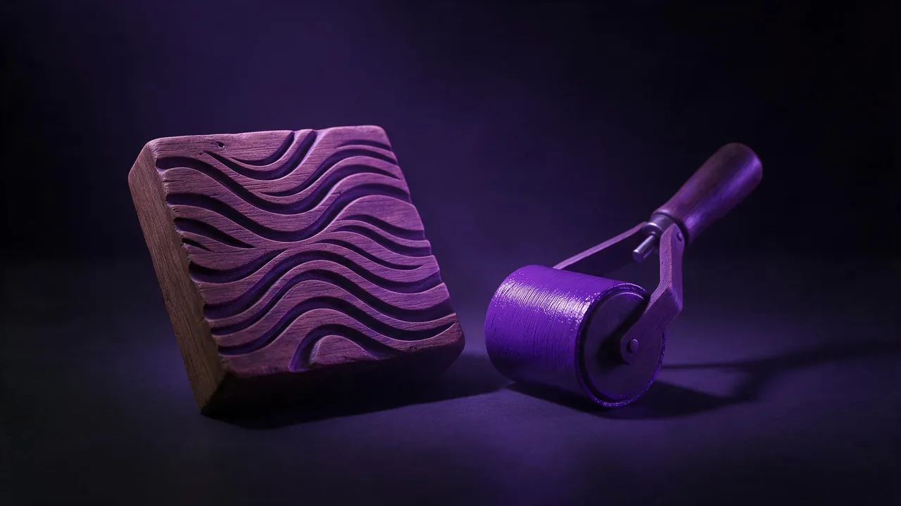
- Linocut or woodcut: carved black lines, one or two colours, visible gouge marks. Strong for book plates and labels.
- Bauhaus or constructivist poster, 1920s: primary colours, circles, bars and diagonals, a strict grid, lots of empty space.
- Art Nouveau poster, around 1900: flowing organic lines, ornamental borders, muted golds and greens.
- Mid-century travel poster, 1950s: simplified landscapes, limited flat palette, long soft shadows.
- 80s anime cel: hand-inked lines, flat fills, a painted background, a slightly faded film look.
- Gouache or watercolour on textured paper: opaque matte strokes or soft blooms of colour with the paper showing through.
A lighthouse on a rocky coast at dusk, Japanese woodblock print, flat colour planes, firm dark outlines, indigo and ochre palette, soft gradient sky, textured paperA city jazz festival poster background, 1920s Bauhaus poster style, red, yellow and black circles and bars on cream paper, strict grid, large empty area at the topRule: one structure, one surface
Media mix well in pairs when they do different jobs: one sets the structure (composition, line, shapes), the other sets the surface (ink, paint, paper). "A woodblock composition printed as a two-colour risograph" works because the two do not compete. Add a third and the model tends to average them into something that is none of the three.
The most common clash is a flat print medium plus photography words. "Volumetric light", "cinematic lighting", "shallow depth of field" and "8K render" pull the picture toward a 3D render and flatten the print look out of existence. Lighting language belongs in photoreal prompts; there it does a lot, as the guide to cinematic lighting shows. Likewise a named medium usually brings its own palette, so if you also list colours, make sure they agree; the post on colour palettes covers that tug-of-war.
How to test a medium quickly
Keep the subject and composition fixed, change only the medium line, and run each version once on the same model. Four runs side by side tell you more than a dozen tweaks of one prompt. A cheap draft model is enough to see whether a medium reads at all; see quick AI drafts. Then move the winner to a stronger model in the studio, where the price shows on the Generate button before each run. Models differ in how well they know a given medium, so if one ignores "risograph", try the same line on another from the catalog before rewriting it.
What naming a medium cannot do
It gives you the look of a medium, not the object. A risograph prompt makes a picture that resembles a risograph print; it does not produce separated ink layers a print shop can run. Period details are approximate: a model may mix the twenties and the fifties, or put a modern object into an old poster, so check the result if historical accuracy matters. Well-known media come out more reliably than rare ones; a little-known regional printing technique may be ignored or turned into something generic. And posters of every era are full of lettering, which models still render poorly; leave space and set the type yourself, as described in making room for text.
Questions
What should I write instead of "illustration" in an AI image prompt?
Name the medium and, if it matters, the period: linocut, gouache on textured paper, 1950s travel poster, 80s anime cel. Add one or two visible traits of that medium, such as flat colour or visible grain.
Can I combine two art styles in one prompt?
Two usually work if one sets the composition and the other the surface, for example a woodblock composition printed as a risograph. Three or more tend to blur into a generic look.
Why does my print-style image look like a 3D render?
Photography and render words such as volumetric light, depth of field or 8K pull the image toward a 3D look. Remove them and describe the print's own traits instead.