Isometric illustrations and 3D-style icons with AI: the prompt words that matter
How to prompt isometric scenes and soft 3D icons: angle, light, material, and a repeatable icon grid. Plus where AI drifts and when to draw by hand.
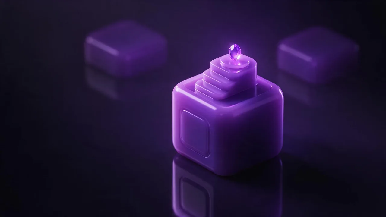
Type "isometric icon" into an image model and you get something that is mostly right: a tidy little cube, a pleasant glow, a slightly wrong idea of perspective. The word is doing less than you think. True isometric means no vanishing point, equal foreshortening on all three axes and no lens at all. A model has no ruler. It has seen thousands of pictures labelled "isometric" and it imitates their look, so the angle drifts from picture to picture. That is fine, as long as you know which words steer the look and which are decoration.
Angle: say it twice, in two vocabularies
One word is not enough. Pair the style word with a camera description: "isometric view, seen from a high three-quarter angle, camera looking down at about forty-five degrees, no perspective distortion, orthographic". The camera phrasing is what pulls a stubborn render out of a wide-angle look. Then add what you do not want: no fisheye, no extreme close-up, no horizon line. If the objects still lean toward the viewer, add "flat parallel edges" and "all vertical lines stay vertical".
Keep the camera words identical across a series. Moving a single phrase, say from "high three-quarter" to "top-down", changes the whole family. Treat the camera sentence as a fixed part of your prompt, the way the word order guide treats the subject.
Light: one source, one direction
Isometric scenes read as clean when the light is simple. Name one soft key light from the upper left, a gentle shadow falling to the lower right, and a faint rim of colour on the opposite edge. Without a direction the model lights each object from a different side, and a set of icons looks like it came from five studios. For more on what each light word does, the lighting prompts post has the vocabulary; here you only need to pick one setup and keep it.
Material: the word that makes it 3D-style
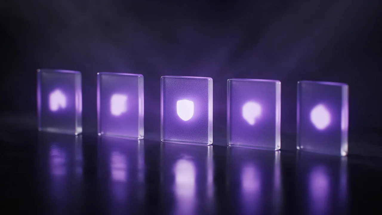
The "3D icon" look is mostly material. Pick one finish and repeat it: soft matte clay, glossy resin, frosted glass, brushed aluminium, felt. Add "rounded edges, soft bevel" because sharp corners tell the model to draw a diagram. If you want the glassy translucent kind, say what shows through ("light passing through the edges"), since glass with no description renders as grey plastic. The material words post lists finishes that models read reliably.
Isometric 3D icon of a rocket on a rounded square tile, glossy resin, soft bevel, rounded edges, one soft key light from the upper left, gentle shadow to the lower right, high three-quarter angle, orthographic, no perspective distortion, centred with generous margin, plain dark violet background, no textThe icon grid: how to keep a set looking like a set
A single good icon is easy. Six that match is the real task. Three habits do most of the work.
- Write a style sentence once. Angle, light, material, tile shape, background. Paste it unchanged in front of every object name. This is the same idea as the style sheet in the slide illustration post.
- Pick one colour per set, plus one accent. Say the base colour of every tile and name the single accent for the object itself. Palette words are covered in the colour palette guide.
- Lock the winner as a reference. Once one icon is right, feed it back as a reference image and change only the object. The reference images post explains how far that goes.
Ask for one icon per render. A prompt for "a grid of six icons" sounds efficient, but the model spends its attention on the layout and the objects come out unequal in size, spacing and finish. Six separate renders with one shared style sentence give you tiles you can line up yourself, and the rare bad one costs a single re-roll instead of the whole sheet. For larger scenes (a tiny office, a harbour, a city block), apply the same sentence and ask for "one small diorama on a floating square base".
What it will not do
Be honest about the limits before you plan a project around this. The studio makes raster pictures at up to 2K, not vector files and not 3D models, so an icon does not scale like a drawing and you cannot rotate it. Strict isometric geometry is approximate: if you need pixel-perfect 30-degree grids for a game tileset, an architectural plan or a technical manual, a modelling tool or a hand-drawn grid will beat a prompt. Fine detail on tiny icons gets mushy when they are shrunk to interface size, and small differences in bevel, shadow length and tone between renders are normal even with a shared sentence. Text on a tile is unreliable, so add labels yourself afterwards. If you need a real 3D object from a picture, that is a different workflow, covered in turning a photo into a 3D model.
Cheap drafts first, then the keeper
Test the style sentence on a draft-friendly model such as Still Lite, from €0.30 a picture, and judge the angle and material on that. When the sentence is right, render the final set on a model with better fine detail; the models page lists what is available, and you can start from the studio. Fix a near-miss with an edit instead of a fresh render: the refine post shows how.
Questions
Does the model produce true isometric geometry?
Approximately. It imitates the look from what it has seen, so angles vary a little between renders. Use camera words such as orthographic and no perspective distortion, and draw by hand if you need exact geometry.
How do I make several icons look like one set?
Write one style sentence covering angle, light, material and background, paste it unchanged before each object, and render one icon at a time. Use the best result as a reference for the rest.
Can I get vector files or a rotatable 3D model?
No. You get raster pictures. For a real 3D object, use an image-to-3D model on the models page, which is a separate workflow.