AI illustrations for slide decks and infographics: one style, many slides
Make a matching set of small illustrations for a presentation or infographic: a style sheet, one idea per picture, quiet backdrops and room for your own labels.
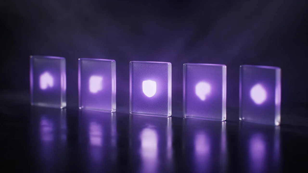
Nobody wants twelve slides with twelve different art styles. A deck or an infographic looks professional when its small pictures feel like one family: same line weight, same palette, same amount of detail. Image models do not give you that by default, because every render starts fresh. Here is a way to get a matching set anyway, and where it still falls short.
Write the style sheet once
Before the first picture, write the part of the prompt that never changes. Treat it as a style sheet: the medium, the palette, the level of detail and the backdrop. Everything that differs from slide to slide goes after it.
Flat spot illustration, soft rounded shapes, thin dark outlines, a limited palette of deep violet, warm sand and one coral accent, no gradients, no shadows, centred on a plain pale background.Naming two or three colours works better than a mood word, and the colour palette guide goes through how to word them so the model keeps them apart.
One idea per picture
A slide illustration is a visual noun, not a scene. Pick the single thing the slide is about (a padlock, a stack of boxes, a seedling in a pot) and name it with one or two supporting details at most. Crowded prompts make crowded pictures, and a crowded picture cannot sit next to a heading without fighting it.
- Concrete beats abstract. Ask for a cardboard box with an arrow leaving it, not for the idea of migration.
- One subject, centred. It crops cleanly and survives being shrunk to a corner.
- Keep metaphors literal. A lightbulb is fine; a lightbulb inside a brain inside a gear is a poster.
Anchor the set with one approved picture
Words alone drift. Once one render has exactly the look you want, attach it as a reference for the next ones and say what to keep (the line style and the palette) and what to change (the subject). The reference images guide covers the wording. Keep using that first approved picture, not the latest result, as the reference, otherwise small differences pile up and the tenth picture no longer resembles the first.
Choose the frame for the slot, not the model
Decide where each picture will sit before you render it. A square suits an icon-sized spot beside a bullet list; a wide frame suits a full-bleed slide background; a tall one suits an infographic column. The aspect ratio guide explains why asking for the wrong frame makes the model invent filler. If a slide needs a picture with an empty half for a title, ask for it the way the post on leaving room for text describes.
Keep the backdrop plain so you can lift the subject out
Infographics usually need the subject on your own coloured panel, not on the picture's background. Ask for a single flat backdrop colour with nothing else on it, then remove it in an editor or follow the steps in the background removal post. A flat backdrop that differs strongly from the subject's colours cuts out cleanly; a soft gradient or a floor shadow leaves a halo. Do not count on a transparent file straight from the generator: ask for a plain backdrop and treat the cutout as a separate step.
Put the words on in your slide software
Do not ask the model to write the labels, numbers or chart axes inside the illustration. Image models draw things that look like text, and a figure or a legend will be wrong sooner or later (the hands and text guide explains why). Generate the picture without any writing, and set every label, number and caption in the deck itself. That also keeps the text editable, searchable and readable by screen software.
A small workflow that holds up
- Write the style sheet and list every slide's one subject on a single page.
- Render two or three subjects with the style sheet and choose the look you like best.
- Attach that approved picture as the reference and render the rest of the set.
- Line the pictures up side by side at the size they will appear; redo only the one that stands out.
- Remove backdrops if needed, drop the pictures into the deck, and add all text there.
What the studio cannot do here
The studio produces raster pictures at up to 2K, not vector files, so an illustration will not scale to a billboard without an upscaling step, and icons that must stay razor sharp at tiny sizes are better drawn or taken from an icon library. Matching is also a matter of degree: even with a style sheet and a reference, line weight and proportions vary a little between renders, so plan to re-roll the odd one out. And the studio does not build the slides or the chart for you. Pick a model on the models page, or open the studio and start with the style sheet above.
Questions
Can AI make icons that match each other?
It can make a set that looks like one family, using a fixed style sheet and a reference picture. Results are pictures, not vector icons, and small differences in line weight between renders are normal.
Should the AI illustration contain the text and numbers?
No. Generate the picture without writing and add labels and figures in your slide or design software, where they stay correct and editable.
How do I get a transparent background?
Ask for a plain, flat backdrop in a colour unlike the subject, then remove it in an editor. Treat the cutout as its own step instead of expecting a transparent file.
Can I use the pictures in a client presentation?
Ownership and licence terms are covered in the post on who owns AI-generated images and on the studio's legal pages. Check them before commercial use.