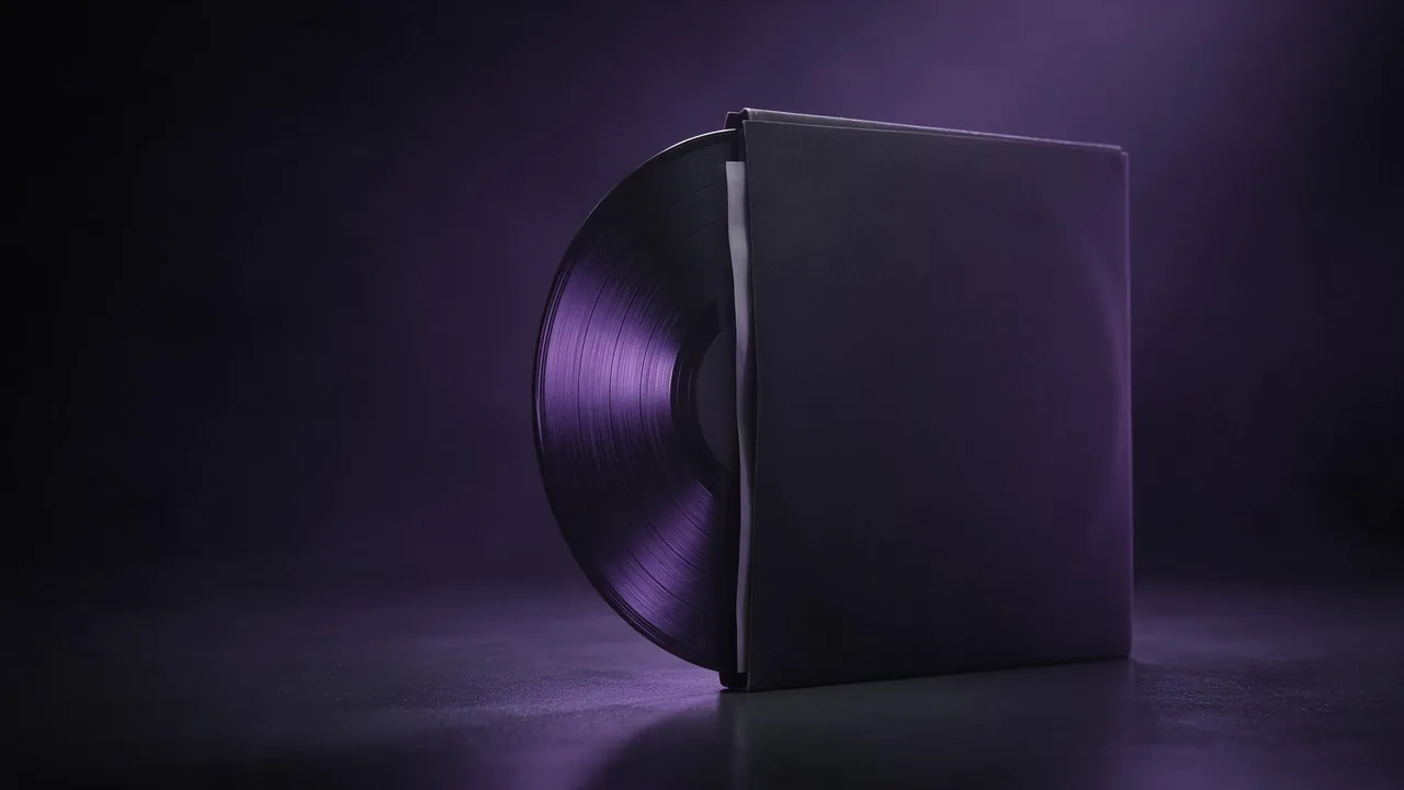
How to make a gift guide cover set with AI for your shop
Build a matching set of gift guide covers for a small shop: one look, a cover per recipient, space left for labels, and every tile sized for its place.

Every November a small shop does the same chore: a gift guide page with six or eight sections (for her, for him, for the home, under a budget, last-minute) and a cover tile for each. Shoppers click the tile that looks like a gift, not the one with the longest label. If the tiles come from six different sources, the page looks like a pinboard. If they come from one look, it looks like a shop that planned its season.
This post is about that set of covers, and only that. The product photos on the pages behind them, and the sale banners, are other jobs; the Black Friday creatives post covers the banners.
Cover tiles are not product photos
A cover tile does not have to show what you sell. It has to say who the section is for and set a mood. That frees you from the hardest part of AI product work, which is making the object match your real stock. A tile can show a wrapped box, a ribbon, a sprig of pine, a scarf draped over a chair, and your real products appear inside the section, in their real photos.
Do not paint your own goods into a tile unless you attach a photo of them as a reference and compare the result with the real thing. If you cannot say the tile shows exactly what is sold, make it a mood and leave the product out.
Write one look note, then change one thing per tile
Before the first render, write three lines: the palette (two or three colour words), the surface and the lighting (matte dark wood, soft light from the left), and the camera (a low three-quarter angle, shallow depth of field). Those lines are pasted unchanged into every prompt. Only the subject changes from tile to tile. The colour palette guide has wording that keeps colours from wandering.
A small wrapped gift box in dark green paper tied with a rust-coloured ribbon, a pair of knitted gloves and a sprig of pine beside it, deep green and rust colour palette, matte dark wood surface, soft light from the left, low three-quarter angle, shallow depth of field, the upper third of the frame plain dark wall with no objectsOne subject per tile is the rule that holds the set together. Two gifts and a scene in a single prompt is how you get a tile that does not belong with the others.
Lock the family with a reference
Words alone drift: the wood changes tone, the light moves. Once one tile is right, use it as the reference for the rest. On the models page, pick an image-to-image model, attach the finished tile with + Image in the composer, and ask for a new subject in the same surface, light and palette. The reference images guide shows how far a reference carries and where it stops.
Use the attached tile as the style reference: same dark wood surface, same soft light from the left, same colour palette and camera angle. New subject: a ceramic candle jar and a paperback book tied with twine, the upper third of the frame plain dark wallExpect the reference to carry the mood better than the details. A ribbon colour or a wood grain can still shift, so put all the tiles next to each other at small size before you accept the set, the way a shopper sees them. The one that jumps out is the one to render again.
Leave room for the label, and set the words yourself
Each tile needs a section name, and many need a budget line. Keep the words out of the prompt and out of the picture: image models still misspell short text, and a wrong word on a cover is seen by everyone. Ask for an empty area instead, as in the prompts above, and set the label in your own layout tool in your shop typeface. The space for text guide covers how to keep that area empty. A budget line also changes by the day, so it belongs in your layout file, never in a render.
Size every tile for its place
- The category grid on the page. Usually 1:1 or 4:3, so render at that ratio; do not crop a wide picture, because the empty area and the subject move.
- The email and social teaser. 4:5 or 9:16, rendered again at that ratio with the empty area moved to the top or bottom.
- The guide's own header. 16:9, one tile that sums up the whole guide, or the family of boxes in one frame.
The aspect ratio guide says which shape goes where. Each ratio is a fresh render with the same look note and the same reference, so budget for it.
What the studio will not do here
It returns image files. It does not build the gift guide page, apply the labels or tell you which tiles get clicks. It cannot guarantee that eight separate renders match perfectly; a reference gets you close and your eye does the last pass. It cannot keep a real product exact unless you check every render against the photo, and it should not set a price, a discount or a delivery date on a picture. For what you may do with the files commercially, read who owns AI-generated images. To start a set, open the studio and render the first tile.
Questions
How do I keep AI gift guide covers consistent?
Write one look note with the palette, surface, light and camera angle, paste it into every prompt, and change only the subject. Use your first good tile as a reference for the rest.
Should the gift guide covers show my real products?
Only with a reference photo and a side by side check. Otherwise show a mood, such as a wrapped box or a ribbon, and let the section show the real photos.
Can I put the section names into the AI image?
It is safer not to. Leave an empty area in the picture and set the section names and any budget line yourself in a layout tool, so nothing is misspelled or out of date.