AI playlist cover art: one look, one colour per mood
Make covers for a whole shelf of playlists with AI: a shared frame, one colour for each mood, a check at fingernail size and a plan for rounded crops.
Say you keep twelve playlists: one for running, one for rainy trains, one for cooking, one for the hours after midnight. Each needs a cover, and the usual way to get twelve covers is to grab twelve unrelated pictures and hope the shelf looks fine. It never does. It looks like a drawer of old postcards. This post is about the other approach: treat the whole shelf as one design job, and let the picture of each playlist change by a single dial, its mood.
Step 1: fix the frame once
Playlist covers are square, so pick 1:1 in the composer and leave it there for the entire set. If you are unsure why the frame matters before the first render, the aspect ratio guide explains what a crop throws away. The other thing to fix is the subject size: decide that every cover has one object that fills about two thirds of the square, centred or sitting slightly low. A set where the subject jumps around in size looks messy even when every picture is good.
Step 2: give each mood one colour and one material
This is the trick that makes twelve covers feel like a family. A mood becomes a colour, and a colour comes with a material, so the picture has something to show besides a tint. Write the table once, before you generate anything:
- Running: hot orange light on wet asphalt and the toe of a shoe.
- Rainy train: cold teal glass with droplets and a smear of yellow from a window.
- Cooking: warm amber on brushed copper and a curl of steam.
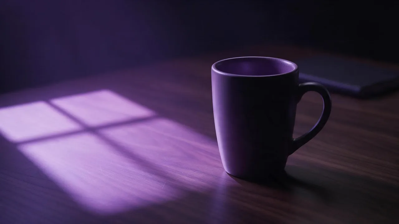
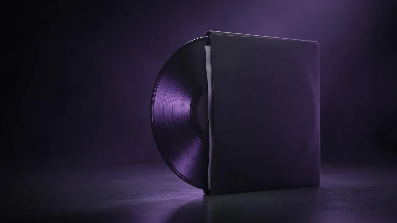
- After midnight: deep indigo, a single lamp, soft felt or velvet.
Colour words do real work in a prompt, and the colour palette guide shows how to name them so the model obeys. Keep everything else in the prompt identical from cover to cover: the same lighting words, the same background, the same distance. Only the mood line changes.
Square album-style composition, a single brushed copper saucepan seen from slightly above, a curl of steam rising, warm amber light from the left, dark charcoal background, soft grain, the pan filling two thirds of the frame, centred, empty dark margin around itStep 3: use the first cover as a reference
Once one cover feels right, attach it with + Reference for the next eleven and change the subject and the colour in the prompt. That gets you the grain, the light and the distance for free, as described in the reference image guide. It is a nudge, not a lock: expect some covers to drift in contrast, and put those aside rather than fighting them. Pinning a seed does not rescue consistency either, as the seed explainer shows.
Step 4: judge at fingernail size, in a circle
A playlist cover is mostly seen small, in a list, next to its neighbours. So the test is not whether the picture is beautiful at full size. Shrink every candidate until it is about the size of a thumbnail on your phone and line the twelve up in a row. Can you tell the mood from the colour alone? Does any cover look like another? If two blur together, the fix is a stronger colour difference, not more detail.
Many apps and players also round the corners or cut the cover into a circle. Keep the subject away from the edges and corners, which is why the prompt above asks for an empty margin. A cover that works as a square and as a circle is a cover that works everywhere.
What about the playlist name?
Leave it off the picture. Streaming apps show the name next to the cover in their own type, so lettering you generate would only repeat it, and models still misspell words often enough to spoil a set. If you do want a name on the art, ask for clean empty space as the guide to leaving room for text describes and add the letters in an editor. The thumbnail guide covers the same thinking for channels and podcasts.
What this cannot do
- The studio makes the picture only. It does not upload anything to a music app; you save the file and add it yourself.
- It will not guarantee that two covers match exactly. The reference helps; it does not fix the result.
- Apps set their own size and file rules for covers and may have rules about AI art. Check them before you rebuild a whole library.
- Using generated images commercially, say on a record you sell, depends on the terms and the law where you sell. The ownership guide goes through it.
Browse the models to pick a still model, then open the studio, set 1:1, and render the first cover of the set. Once it holds up at small size, the other eleven are a table and a copy of one prompt.
Questions
What shape should a playlist cover be?
Square, so choose 1:1 in the composer before the first render. Keep the subject away from the corners, because many apps round them or crop to a circle.
How do I make AI playlist covers look like a set?
Fix the frame and the subject size, give each mood one colour and one material, keep every other prompt phrase identical, and use your first good cover as a reference for the rest.
Should the playlist name be in the picture?
Usually not. Apps show the name beside the cover, and models can misspell words. Ask for empty space and add any lettering yourself in an editor.