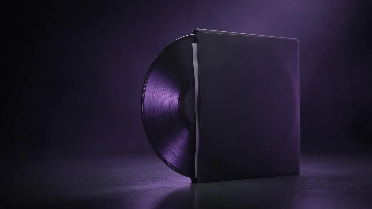
Putting a product into a lifestyle scene with AI: the mug on the desk, the bottle on the shelf
Place a product in a believable everyday scene with a prompt: set the room, props, light, surface and scale, and stop floating objects and stray logos.
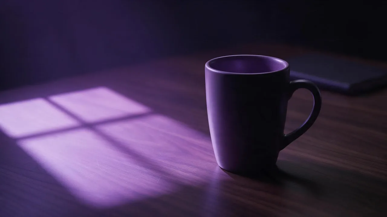
A product on a plain backdrop tells a shopper what it is. A product on a desk, a shelf or a kitchen counter tells them where it would live. That second picture is what a lifestyle scene sells, and it is where image models go wrong in ways a studio shot never does: the mug hovers a hair above the wood, the bottle is the size of a lamp, and a brand name nobody asked for appears on the book behind it.
Studio setups, white marketplace frames and material words have their own posts (studio shots, white backgrounds, material words). This one is about the room around the product.
Write the scene as a short set list
Think like a set decorator, not a poet. A scene needs five decisions, and a prompt that makes all five comes out far steadier than one that says "cozy lifestyle vibe".
- The place. A home office desk, a bathroom shelf, a kitchen counter by a window. One place, named plainly.
- The surface. What the product stands on: oiled oak, white tile, a linen cloth. The surface is what proves the object is resting on something.
- The props. One or two, chosen to belong to the same moment: a closed notebook next to the mug, a folded towel beside the bottle. Props that explain the use beat props that merely decorate.
- The light. One direction and one quality: "soft morning light from a window on the left". The lighting glossary lists the words.
- The camera. Height and distance: "eye level, shallow depth of field, the product sharp and the background soft".
A matte white ceramic mug on an oak desk in a home office, a closed notebook and a pen beside it, soft morning window light from the left, a gentle shadow falling to the right of the mug, eye-level shot, shallow depth of field with the background softly blurred, natural lifestyle photographyKeep the product the hero
In a scene, everything competes with the product for attention. Three habits keep it in front.
- Say who is in focus. "The mug sharp, the background out of focus" pushes the room back. Without it, a model may render the desk lamp as crisply as the product.
- Keep the props smaller and quieter. A prop in a muted colour, behind or beside the product and not in front of it, supports the picture. A bright, large prop becomes the subject.
- Give the product the best light. Describe the light as falling on the product, with the background a little darker. People look at the brightest, sharpest thing in the frame.
Scale: tell the model how big the thing is
A model has no ruler. It guesses size from whatever else is in the picture, and a lone bottle with no neighbours can come out the size of a vase. Fix it with a neighbour of known size: a hand-sized mug next to a pen, a travel-size bottle beside a toothbrush, a candle beside a matchbox. Name the object the way it is sold ("a travel-size bottle", "a standard office mug") and put one familiar item within reach of it.
Floating, pasted in, and the shadow that fixes it
The most common failure is an object that sits on top of the scene instead of in it. Three things give it away: no contact shadow, a shadow that falls the wrong way against the light, and a surface that does not react to the object at all. Ask for each by name.
A small amber glass bottle on a white bathroom shelf next to a rolled grey towel, bright window light from the right, a soft contact shadow where the bottle touches the shelf and a longer shadow falling to the left, tile wall softly out of focus behindReflections count too. A glossy shelf should show a faint mirror of the base, a matte wooden desk should not. If a surface looks wrong, name its finish. Metal and glass have extra rules, covered in the posts on chrome and metal and glass and liquid.
Use a reference photo for the product, the prompt for the room
A prompt can describe a generic mug but not your mug. When the product has to be the real one, attach a clear photo of it with + Reference and let the prompt carry only the scene around it: "this mug on an oak desk in a home office, window light from the left". The model borrows shape, colour and design from the photo. The method for keeping a look steady across many renders is in reference images for consistent style.
Pick a reference shot straight on, in even light, with the whole product in frame and the label facing the camera. A reference taken in a dim room with a strong colour cast teaches the model that cast, and it will come back in the scene. The models page shows which models take an image as input; check the price on the Generate button before you run.
What goes wrong, and the quick fix
- Extra logos and text. Models love to print brand-like words on books, packaging and screens. Say "no text or logos anywhere except on the product", keep props plain, and read the negative prompts post for how far that goes.
- The label changes. Even with a reference, fine print can drift. Zoom to full size and check every render, and for packaging with a lot of text plan to place it yourself in an editor. The hands and text post covers repair.
- The scene is too busy. With more than a few props the product shrinks into the clutter. Delete a prop before you add a word.
- Mixed light. A warm lamp and a cold window in one prompt give two competing shadows. Choose one source.
- A different product every time. Without a reference the shape drifts between runs. Keep the same reference attached and change only the scene sentence.
A workflow that wastes few renders
- Write the set list as one prompt, with the product described or attached with + Reference.
- Render a small batch and judge scale and shadow first, product details second.
- Fix one thing per round: the neighbour for size, the shadow line for grounding, a deleted prop for clutter.
- When the scene works, keep its wording and swap only the place for the next product, so a catalogue reads as one set.
- Check the product against the real item at full size before it goes on a page.
What the studio cannot do
- It does not know your real product. Without a reference it draws a plausible one; with a reference it is close, not guaranteed identical.
- It cannot guarantee scale. Size is inferred from the picture, so verify it against what you sell.
- It cannot promise clean text. Labels, small print and logos can warp, and no wording in the prompt makes that impossible.
- Lifestyle renders are illustrations of use. Do not present one as a photo of a real room or a real customer, and label it where a platform or law asks for it.
Open the studio, attach the product, write the set list, and compare a few renders side by side before you pick.
Questions
How do I stop a product from floating in an AI lifestyle scene?
Ask for a soft contact shadow where it touches the surface and a longer shadow falling away from the light, and name the surface material. Make sure the shadow side matches the light direction.
How do I keep my real product in an AI generated scene?
Attach a clear, straight-on photo of it with + Reference and write only the scene in the prompt. Check the label and shape at full size, since fine print can still drift.
Why is my product the wrong size in the picture?
The model has no ruler and guesses from neighbouring objects. Put an item of known size within reach, such as a pen or a key, and change that item rather than the product description.
How do I avoid extra logos and text on props?
Keep props plain, say that no text or logos should appear except on the product, and inspect each render. It reduces the problem but cannot remove it entirely.