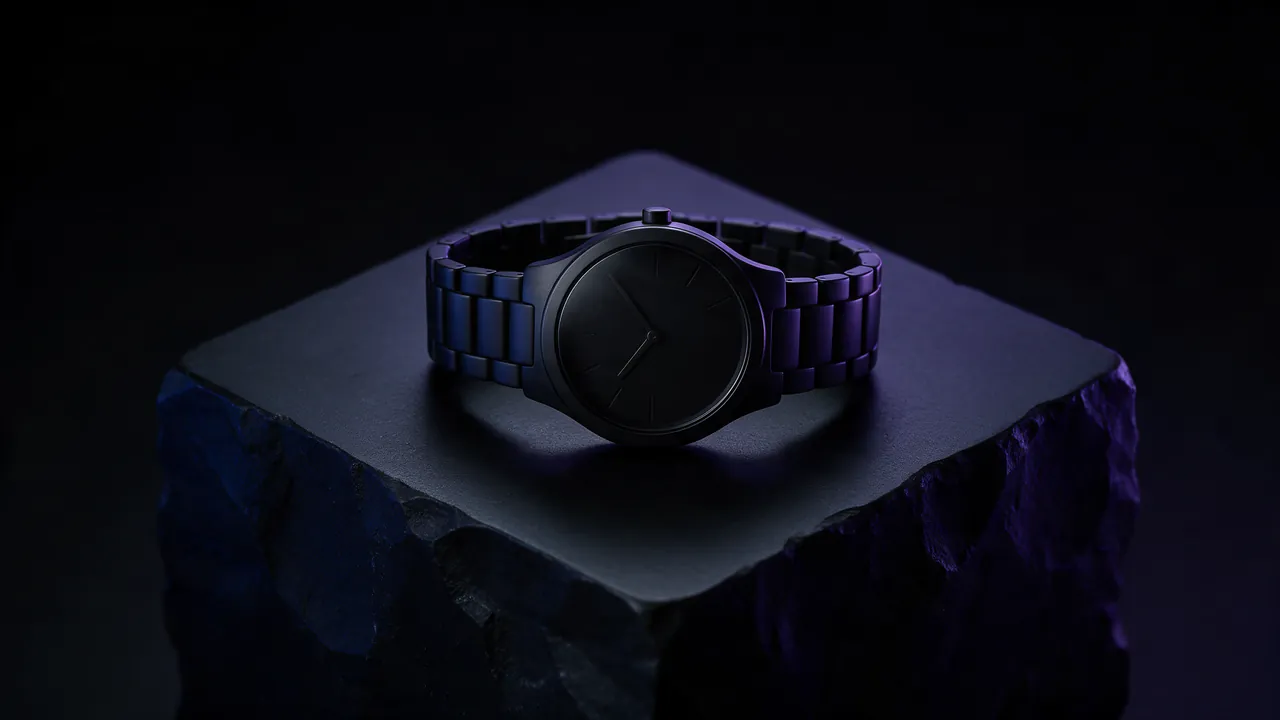
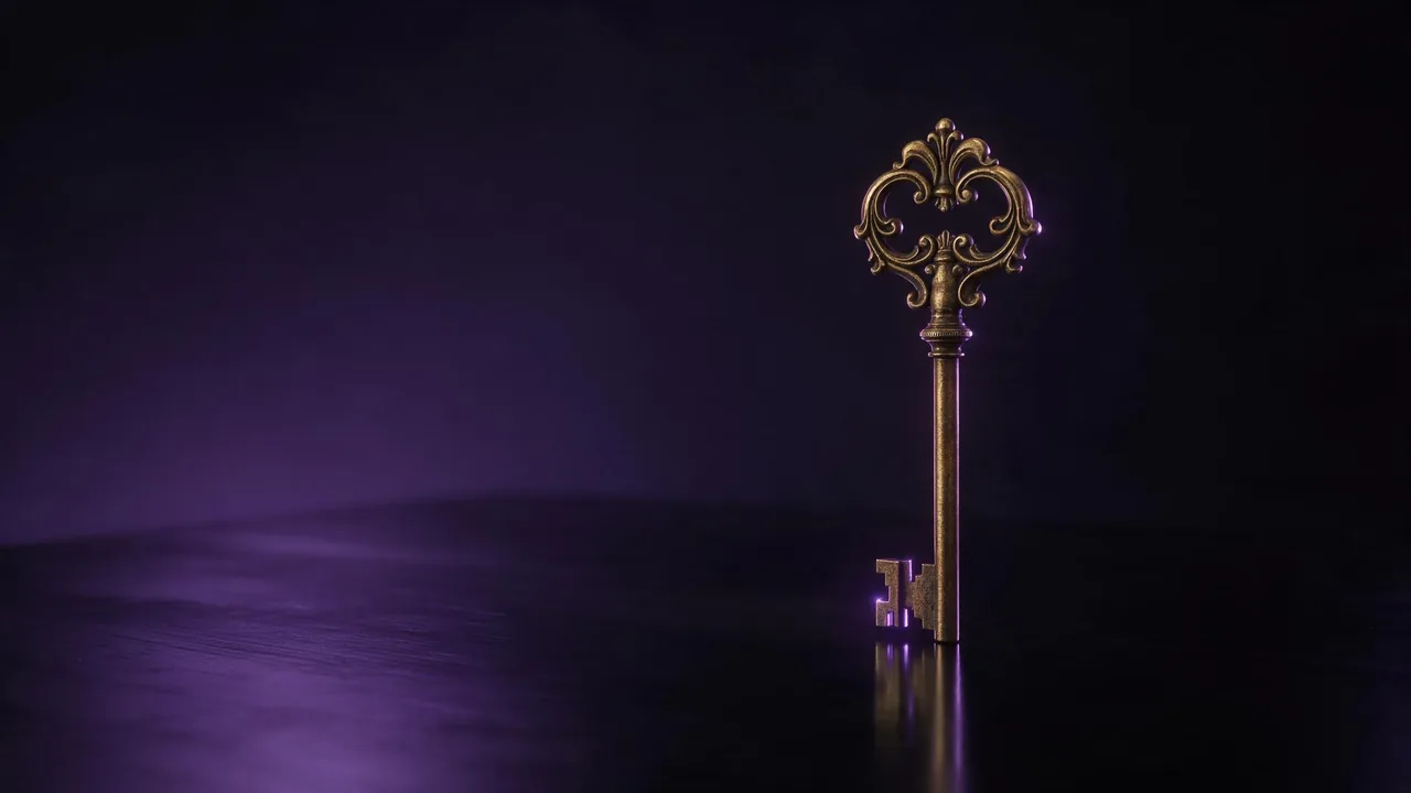
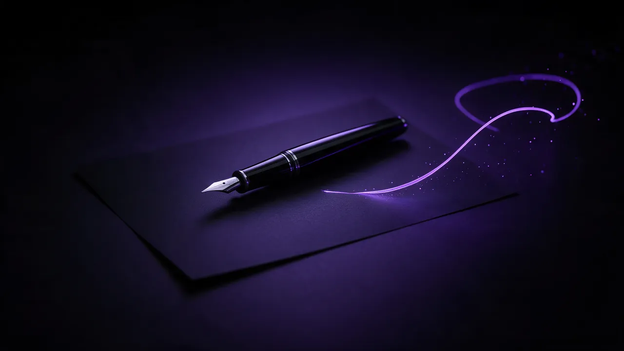
AI thumbnails and cover art for a channel or a podcast
Make video thumbnails and podcast covers with AI: pick the frame first, design for a tiny size, leave room for your title and keep a series looking like one.
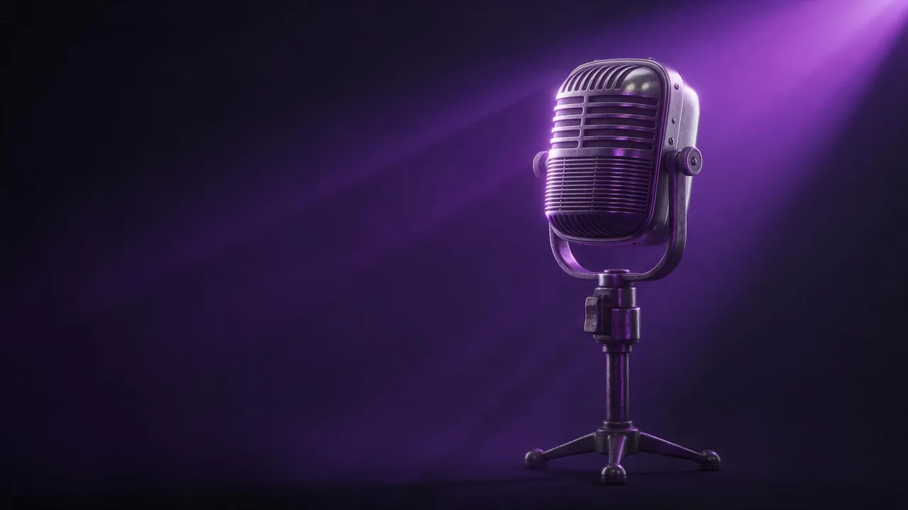
A thumbnail has one job and about one second to do it. Someone scrolling a feed or a podcast app sees a small square or a small rectangle, decides whether it is for them, and moves on. That makes cover art a strange design problem: the picture is made at full size and judged at the size of a stamp. Here is how to brief it, render it and check it, from the first idea to a set that looks like one show.
1. Know the frame before you prompt
A video thumbnail is wide, 16:9. A podcast cover is square, 1:1, and is usually shown far smaller. Choose the aspect ratio in the composer before the first render: a wide picture cropped to a square loses whatever was on the sides, and a square stretched to wide has nothing there to begin with. The aspect ratio guide lists which shape suits which place.
2. One subject, big and close
At thumbnail size, detail disappears and shapes remain. The covers that work have one clear subject, large in the frame, against a background that is simple or out of focus. Ask for exactly that:
A vintage film camera on a wooden desk, close-up, the camera filling the right half of the frame, dark blue background, strong warm key light from the left, high contrast, clean empty space on the left side- Contrast over subtlety. A bright subject on a dark ground, or the reverse, reads at any size. Soft pastel on pastel does not.
- Light that shapes the subject. A single strong light from the side gives an object an edge; the lighting prompt guide has the words for it.
- No crowd. Five small things in a thumbnail read as one smudge. If there must be several, make one of them clearly the hero.
3. Leave room for the title, then set it yourself
Most thumbnails carry a few words: an episode title, a hook, a number. You can ask the model for them in quotes, and short words often come out right. For a cover you will reuse, it is usually better to ask for clean empty space where the title goes and add the lettering in your own editor. You get your fonts, perfect spelling, and a background you can reuse for the next episode with a new title.
4. Draft cheap, finish strong
Cover art is a guessing game until you see options. Render several quick drafts on Still Lite, from €0.30 each, to find the idea, then make the chosen one on Still, from €0.40, up to 2K. Every price appears in the composer before you press Generate, and a render that fails is not charged.
5. Check it at the size people see
Before you pick a winner, shrink it. Look at the picture at roughly the size of a thumbnail in a feed, or zoom your screen out until it is that small. Ask three questions: can I tell what the subject is, does it stand out from the colours around it, and is there still room for the title? If the answer to any of them is no, a bigger subject or a stronger contrast will fix it faster than a new idea.
6. Make a series look like one show
A channel or a podcast wants its covers to be recognisable as a set. Two habits help. Keep a base prompt with the fixed parts - lighting, palette, background, framing - and change only the subject per episode. And when a first cover lands, use it as a reference image for the next ones, so the style carries over; the reference images guide explains how. The product photography guide uses the same approach for a catalogue of items.
What AI cover art will not do for you
- It will not know your face. If you want to be on the cover, start from your own photo as a reference, and never use someone else's likeness without permission.
- It will not guarantee a logo or a long title letter for letter. Set those yourself.
- It will not know what your audience clicks. Try two versions and keep the one that performs.
Browse the image models to see which ones take a reference, then open the studio, set the frame and start with three drafts.
Questions
What aspect ratio should a YouTube thumbnail or a podcast cover be?
A video thumbnail is 16:9 and a podcast cover is square. Choose the ratio before you render, so nothing important is cropped away later.
Should the AI write the title on the thumbnail?
Short words in quotes often come out right, but for a cover you reuse, ask for empty space and set the title yourself. The spelling is guaranteed and the background works for every episode.
How do I keep all my covers in one style?
Keep a base prompt with the lighting, palette and framing fixed, and use your best cover as a reference image for the next ones.